Stencil - a Web Components Compiler
If you read through our Web Components Perks & Flaws series, you may remember that Web Components have some flaws, for example
- having to repeat much boilerplate code and respect the render loop,
- missing a template engine, or
- creating a build pipeline
Stencil solves all of these problems and offers even more help with creating Web Components. Stencil describes itself as
[…] a toolchain for building reusable, scalable Design Systems. […] The magical, reusable web components compiler.
Stencil can create Web Component libraries, applications, and PWAs. In this article, we are going to focus on the libraries only.
The framework leverages well-known features from both Angular and React, for instance, virtual DOM, decorators, JSX, or TypeScript. It also supports reactive data-binding, static site generation, or async rendering. And there is still more that we get out-of-the-box.
The Stencil compiler generated components that are built on top of Web Components. We can use them with any framework we like, or even without a framework at all. Besides, due to the compiler, it can automatically optimize our components for performance.
A significant advantage is that we don’t have to study a big API surface. Stencil has a tiny API, and we can leverage a lot of your existing web development knowledge. By that, all our components will be future-friendly. Either because they work due to the web standard, or because it is the compiler’s job to compile our component for new and changing standards.
The Sample Scenario
In this article, we are creating two small Web Components using the PokéAPI:
- The first component will request the list of Pokémons from the API.
- The second component will do the pagination.
It will visualize how many pages are available and provide an event that fires to request another page.
Create a New Project
To start with Stencil, we need a current NodeJS version and at least npm version 6. Out-of-the-box, that would be NodeJS 10.3.0. After we prepared NodeJS, we can create a new project by typing the following command into a command line terminal:
npm init stencil
npm will download the required sources for the Stencil CLI and start it. We can now decide between three options: ionic-pwa, app, and component.
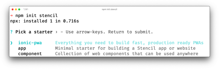
The option ionic-pwa will create a new project for a Progressive Web App based on the Ionic Framework. The option app creates a new project for a Single-Page Application with Stencil and the Stencil Router. The third option component creates a Web Components library. As mentioned in the beginning, we are building a library, so we chose the third option. After selecting the option, the CLI creates a new folder with the project name and an example component.
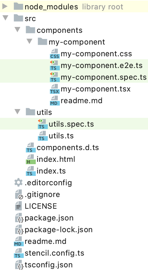
The most important files and folders are package.json, stencil.config.ts, src/index.html, src/components, and src/components.d.ts.
Let’s take a closer look at the package.json. It contains some predefined commands:
build: Builds all our components for usage in other projects.start: Starts the development live-reloading environment of Stencil. We use that command when we develop our library.test: Starts a single run of unit tests. Perfect for integration into a CI system.test.watch: Runs the unit tests whenever the code changes. If you like to do Test Driven Development, that command is beneficial.generate: Generates a Stencil Web Component.
The next file stencil.config.ts contains our project’s configuration, for example., the kind of output we want to have or the plugins we want to use. There is a good overview of the possibilities within the documentation.
Per default, Stencil uses CSS for the components. However, we want to use SCSS. To do so, we need to execute the following command:
npm install -D @stencil/sass
The command will install the plugin for SCSS. Then we need to change the file stencil.config.ts and add the following property to the existing config object:
plugins: [sass()],
Don’t forget to add the import:
import { sass } from '@stencil/sass';
Now, let’s take a look at the src/index.html file. During development time, the browser will load this file to bootstrap our components. It won’t be part of the generated output later when we build the library for other projects. The development of the components takes place in src/components.
Last but not least, there is the file src/components.d.ts. It is an auto-generated TypeScript definition file containing the type definitions of our components. This file is useful for our IDEs to provide better auto-completion features.
Currently, there is no standard-based technical documentation for Web Components. The W3C is discussing some possibilities and with components.d.ts Stencil implements an idea. It is possible that this specific file may not exist anymore in the future, has different contents, or will be replaced by another possibility.
Our First Component: Pokémon List
After the initial setup, we are able to create our first component. Let’s run the following command:
npm run generate
The command starts the Stencil CLI to generate a new component. An interactive dialog gathers some information. At first, we have to provide a name. The name must contain a dash (due to the Custom Elements standard), so we use pokemon-list here. After that, we can specify which files to generate. In our case, we want to have the Stylesheets but not Spec Test and E2E Test. At the time being, Stencil will generate a .css– instead of a .scss-file, so we have to rename it later.
Let’s open the file src/components/pokemon-list/pokemon-list.tsx and insert the following code:
					import { Component, ComponentDidLoad, ComponentInterface, h, Host,
             Prop, State } from '@stencil/core';
import { PokeApiService, Pokemon } from './poke-api.service';

@Component({
  tag: 'pokemon-list',
  styleUrl: 'pokemon-list.scss',
  shadow: true,
})
export class PokemonList implements ComponentInterface, ComponentDidLoad {
  private itemsPerPage = 10;
  private offset = 0;
  private pokeApiService = new PokeApiService();

  @State() private pokemons: Pokemon[];
  @State() private pokemonCount: number;

  /** The title of this Pokémon List. */
  @Prop() listTitle = 'Pokémon List';

  componentDidLoad(): void {
    this.loadPage();
  }

  private loadPage(): void {
    this.pokeApiService.loadPage(this.offset, this.itemsPerPage)
      .then(response => {
        this.pokemons = response.results;
        this.pokemonCount = response.count;
      });
  }

  render() {
    return (
      <Host>
      </Host>
    );
  }
}
At first, we create a class PokemonList. It implements the interfaces ComponentInterface and ComponentDidLoad. Every Stencil component should implement ComponentInterface. The only method to be implemented is render. Additionally, every component must use the @Component decorator. It allows us to set the tag name, the styleUrl, and if shadow (DOM) shall be used or not. It’s also possible to use the property assetsDirs. With it, we can reference folders that will get processed by the build pipeline, for example for images or font files.
Next, we define the fields itemsPerPage, offset, and pokeApiService. We need the first two fields for pagination. The service will call the actual PokéAPI to get the data. We have not created the service yet, but we will do so later. We could also use real ECMAScript private fields instead of TypeScript’s access modifier private.
Then we define two additional fields: pokemons and pokemonCount. The first one holds the list of Pokémons shown in the UI. The second holds the count of all known Pokémons from the API. Both fields have a @State decorator. @State helps to manage the component’s internal state. If a field decorated with @State gets changed, Stencil will recognize that change and automatically call the render method to update the UI. It is important to know that Stencil does a reference check only and not a deep equal if the state is an object or array.
The next field we create is listTitle. It is a simple string we are using for a headline. It uses the @Prop decorator. Changing a field with @Prop decorator will also call the render method. @Prop allows that you can set the field additionally via its HTML attribute representation. Keep in mind that @Prop must be used with primitive data types only because HTML attributes are string-based. Only for primitive data types, Stencil will generate the corresponding HTML attribute. However, if you specify an option, you can also use the @Prop for arrays and objects. Avoid that for performance reasons. Per convention, Stencil will generate a dash-case name for the attribute. To set in HTML you have to use list-title.
Let’s take a look at the implementation of the interface ComponentDidLoad. Specifying that interface requires to implement the method componentDidLoad. It is a lifecycle method of a Stencil component called once after the component has been fully loaded and rendered for the first time. We can also implement the Web Component lifecycle methods like connectedCallback or disconnectedCallback.
Within the method, we call the private method loadPage. It uses the pokeApiService to request the page and write the result to our fields. As mentioned before, the change will automatically trigger the render method because it has a @State decorator.
Next, take a look at the render method. It is the workhorse that defines how our component will look like. Currently, we only have a Host element. Host is a virtual element of Stencil that allows setting CSS classes or events to the Shadow Host.
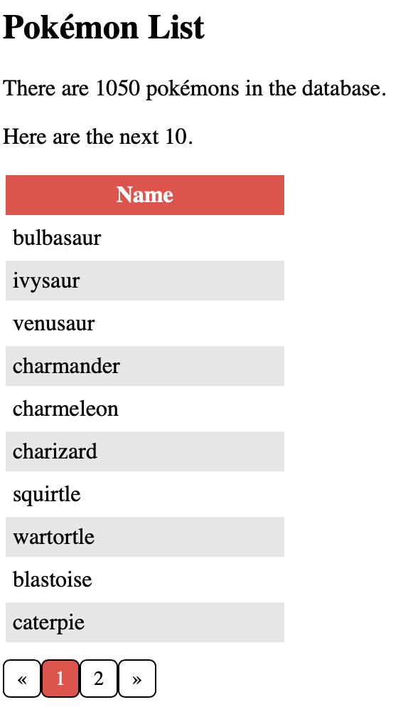
To get a visual representation, let’s replace the Host element with the following code:
					<Host>
  <header>
    <h2>{this.listTitle}</h2>
  </header>

  {this.pokemons && this.pokemons.length
    ? <div>
      <p>There are {this.pokemonCount} pokémons in the database.</p>
      <p>Here are the next {this.pokemons.length}.</p>

      <table>
        <thead>
          <tr>
            <th>Name</th>
          </tr>
        </thead>
        <tbody>
          {this.pokemons.map(pokemon =>
            <tr>
              <td>{pokemon.name}</td>
            </tr>,
          )}
        </tbody>
      </table>
    </div>
    : <div>Loading...</div>
  }
</Host>
JSX allows us to embed HTML directly in our TypeScript code. To output a simple value, we use single curly brackets. In our case, we output listTitle in the h2 element. Then, we’re using a ternary operator to output HTML based on a condition partially. If pokemons is truthy and has a length, we are outputting a HTML table. In JSX, we don’t use forEach to iterate the array but map, that itself returns JSX. If pokemons is falsy or does not have a length, we output the text “Loading…”. It is a simple loading indication and could be replaced by a loading spinner component.
Since we don’t do anything special in the component’s scss file, we are leaving that out of the article.
Loading Data via Service
Currently, our component cannot show data because the service is missing. Let’s create a new file, poke-api.service.ts, and insert the following code:
					export interface PokeApiListResult<T> {
  count: number;
  next: string;
  previous: string;
  results: T[];
}

export interface Pokemon {
  name: string;
  url: string;
}

export class PokeApiService {
  private readonly pokeBaseUrl = 'https://pokeapi.co/api/v2/';

  loadPage(offset: number, size: number): Promise<PokeApiListResult<Pokemon>> {
    return fetch(`${this.pokeBaseUrl}pokemon?offset=${offset}&limit=${size}`)
      .then(response => response.json());
  }
}
It is a straightforward service to request some data. It offers only one method called loadPage to request a single data page from the PokéAPI. It uses an offset and size parameter to specify the data page and returns the original API result converted to JSON.
Because we are using TypeScript, we define two interfaces for the API result.
Side note: Stencil also suffers from the general issue of service location/dependency management. For more information read our articles about data sharing and framework integration or our experiment on implementing a dependency injection system for Web Components.
Adapt the Index.html
To use our component during development time, we need to adapt the index.html. Add the following tag inside the body-tag:
Optionally, we can set the attribute list-title to change the title.
Creating the Pagination
In this step, we want to create another component for pagination. Again, we use the Stencil CLI to create a new component named list-pagination. Then, replace the content of the newly created file list-pagination.tsx with the following code:
// import { ... } from '@stencil/core'
@Component({
tag: 'list-pagination',
styleUrl: 'list-pagination.scss',
shadow: true,
})
export class ListPagination implements ComponentInterface, ComponentWillLoad {
@State() private totalPages: number;
@State() private currentPage: number;
@State() private previousPage: number | undefined;
@State() private nextPage: number | undefined;
/** The count of all items in the list. */
@Prop() count: number;
/** How many items per page shall be shown on the list? */
@Prop() itemsPerPage: number;
/** The current offset of the list.*/
@Prop() offset: number;
/** Emits, when a paging is triggered. */
@Event() paging: EventEmitter<{ offset: number }>;
private handleClick(offset: number): void {
this.offset = offset;
this.calculate();
this.paging.emit({ offset });
}
private calculate(): void {
this.totalPages = Math.ceil(this.count / this.itemsPerPage);
this.currentPage = Math.floor(this.offset / this.itemsPerPage) + 1;
this.previousPage = this.currentPage - 1 <= 0 ? undefined : this.currentPage - 1;
this.nextPage = this.currentPage + 1 >= this.totalPages ? undefined : this.currentPage + 1;
}
componentWillLoad(): void {
this.calculate();
}
render() {
return (
<Host>
<ul>
<li onClick={() => this.handleClick(0)}>«</li>
{
this.previousPage &&
<li onClick={() => this.handleClick(this.offset - this.itemsPerPage)}>{this.previousPage}</li>
}
<li class="current">{this.currentPage}</li>
{
this.nextPage &&
<li onClick={() => this.handleClick(this.offset + this.itemsPerPage)}>{this.nextPage}</li>
}
<li onClick={() => this.handleClick(this.count - this.itemsPerPage)}>»</li>
</ul>
</Host>
);
}
}
Let’s take a closer look at the code. Here are two things, we have not encountered before: the interface ComponentWillLoad and the decorator @Event.
ComponentWillLoad requires to implement the method componentWillLoad. It is called after the initialization of the component, but before the first render occurs. In our case, we call the method calculate. It will figure out the pagination based on our @Prop fields.
To define a CustomEvent, we can use the @Event decorator. All events must be of type EventEmitter. We want to fire an event if the user clicks on a specific page. We can use an onClick handler on our HTML elements and call the method handleClick. It takes care of the click and emits our events.
Using the Pagination
To use our new component, we need to make two changes in the pokemon-list.tsx:
					// Add the following method
private handlePaging(paging: { offset: number }): void {
  this.offset = paging.offset;
  this.loadPage();
}

// Insert in HTML directly after </table>
<list-pagination
  count={this.pokemonCount}
  offset={this.offset}
  itemsPerPage={this.itemsPerPage}
  onPaging={event => this.handlePaging(event.detail)}
/>
We add the method handlePaging which is the event handler for our paging event of the list-pagination component.
In the code you can see another convention. To use the event, we have to use onPaging. All events in Stencil will be prefixed with on.
Our development is now done!
We can use npm start to start the dev environment and take a look at our component.
Documentation Generation
One more feature makes Stencil special. Without further ado, we get auto-generated documentation for our components. Let’s run the following command:
npm run build
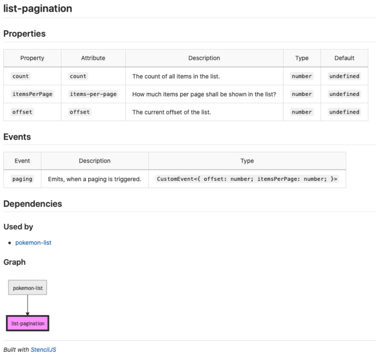
This command creates the final output of our component library, ready for usage in other projects. We get a specific TypeScript definition file per component. Additionally, we get a markdown file with documentation. The documentation file consists of two parts. The first part is hand-written documentation that we can add to our components. The second part is generated on our own. Properties (@Prop) and events (@Event) are documented with their type and comments. And we get a dependency graph between our components. Both parent-child and child-parent dependencies are visualized. The markdown embeds MermaidJS graphs for generating the diagram.
One more feature makes Stencil special. Without further ado, we get auto-generated documentation for our components. Let’s run the following command:
npm run build
This command creates the final output of our component library, ready for usage in other projects. We get a specific TypeScript definition file per component. Additionally, we get a markdown file with documentation. The documentation file consists of two parts. The first part is hand-written documentation that we can add to our components. The second part is generated on our own. Properties (@Prop) and events (@Event) are documented with their type and comments. And we get a dependency graph between our components. Both parent-child and child-parent dependencies are visualized. The markdown embeds MermaidJS graphs for generating the diagram.
Conclusion
In this article, we only scratched the surface of Stencil, there is much more to explore about it. We took a look at how to create Web Components alongside their documentation. That is a powerful feature, which is currently needed if you create a library. We encountered specific Stencil interfaces and decorators to make our Web Components more powerful and hide boilerplate-implementation. The generated packages can be used in any application, so you can finally leverage code sharing at its best!
Happy coding!